Shining Bright: A New Look for Loopio’s Brand
When Loopio was founded in 2014, our co-founders Zak, Matt, and Jafar were laser-focused on solving the RFP response problem. They had felt the pain of responding to RFPs in their previous roles, and knew others felt the same way.
Fast forward to today, and the proof is in the numbers: over 1,700 customers have tackled more than 6 million answers (and saved countless hours) by using Loopio.
Large global brands like American Express, Goldman Sachs, DocuSign, and many more are amongst our customers today.
And although our company values still ring true—and we aren’t afraid to let our “Loopi” personality shine through—the truth is that we’ve evolved significantly as a company over the past 11 years.
That’s why today, we’re excited to share a look behind the curtain at the future of Loopio—a world where our brand and product truly connect.
Here’s a look at what we’ve been up to, and the full reveal of Loopio’s reimagined brand identity.
The Reveal: Introducing the Future of Our Product
At Product Summit in October, we showcased a video that revealed the future of Loopio’s product. Eugene Ho, our Chief Product Officer, shared our vision of a future where agentic workflows in Loopio will give response teams a true competitive edge.
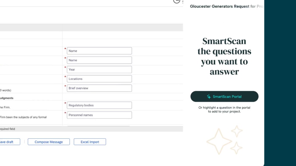
Loopio’s vision for what the future of response management will look like one year from now.
What we didn’t reveal: The look showcased in that video reflects our future platform—as well as our new brand.
Our talented Marketing and Product Design teams collaborated to bring our product vision to life in our corporate brand.
The goal was to elevate Loopio’s brand story by designing an experience that brings out the feeling you get when using Loopio—one of confidence and trust, but also momentum and collaboration.

Connecting the Dots (or Loop) to Our Brand
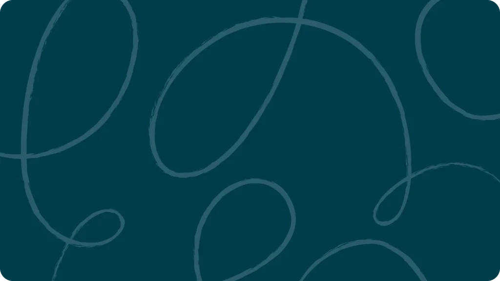
This visual refresh is all about connecting the dots (or loop) between our brand and product. And while our iconic loop has evolved, its pattern remains the centrepiece of our approach to response management.
The hand-drawn patterns, soothing color palette, and candid photography all work together to represent the new Loopio. It’s reflected in the feedback loops of knowledge that go into every RFP, continuously improving every answer in your Library and beyond.
The loop also speaks to the idea of connection.
Loopio’s superpower is its ability to create connections. Our platform connects you to the information you need to complete a project like an RFP, RFI, or answer a question on a sales call. It can also connect you with people on your team, even from afar, to collaborate more effectively on projects.
These connections are powerful, and that’s why we continue to focus on the loop pattern as a core component of our new visual identity.
We build connections between teams: sales and proposals.
Between businesses: driving pipeline and creating new jobs.
And lastly: between people and technology.
Loopio’s platform is the bridge that connects your knowledge, brings together your teams, and unifies your approach to winning.
Starting today, you’ll see Loopio’s new brand across our materials, including emails, social, website, and, of course, our blog.
Our new typography is clean and crisp, just like you want your completed RFPs to be—creating a polished environment for proposal professionals to do their best work.

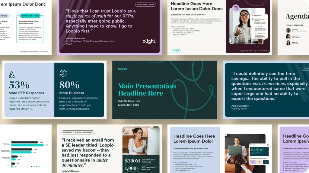
You’ll also notice a new style to our website photography with a warmer, people-first design, showcasing diverse, real, human interactions between professionals working together in a collaborative environment.
The vignettes include engaging conversations between teams and people thriving in work environments where they feel supported. We strive to foster this type of environment in our platform—and in our company’s core values.

We’ve kept our iconic teal color and Loopio logo that we all know and love, and swapped some of our more vibrant brand colors for a smooth palette to balance and elevate Loopio’s overall look and functionality, so you can stay focused on higher-impact tasks.
While our brand colors have softened, we’ve sharpened the competitive edge Loopio provides response teams—and now it truly shows.
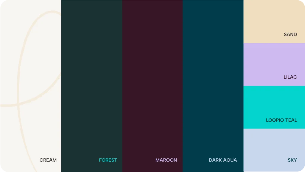
We worked to create an elevated, refreshed color palette, while still making room for moments of playfulness with intentional use of accent colours, keeping contrast and accessibility top of mind.
While our refreshed brand is now live on loopio.com, changes within our product will officially roll out in 2026.
This refresh is our product vision brought to life. While the changes to our product will roll out in 2026, we simply couldn’t wait to share Loopio’s vision for the future with you, and our brand is a key part of that.
Celebrating More Than a Decade of Growth, Together
This evolution of Loopio’s brand celebrates all that we’ve built together over the past 11 years. It also signals where we’re going next.
Our goal is to help our customers shine ✨ in every response—and that’s something that isn’t changing.
We’re still the same Loopio you know and trust—with our award-winning support services, easy-to-navigate UI, and approachable nature—just with a bolder look that reflects the elevated product experience you can expect from our platform.
There’s so much more to come, and we’ll keep you in the loop on upcoming changes.
Our commitment to you, our customers, is what motivates us to elevate everything we do, and that dedication will always remain at the heart of our work.
Thank you to everyone who has supported us over the years—here’s to the next chapter.